It’s yet again time to celebrate beautiful and creative maps. Be sure to check out also our first take on this subject, Trends and ideas for interactive maps in 2021.
This is part two of the same series and now we’ll dive deeper into the world of map-based data visualizations with five fresh examples.
The story on Manhattan’s population
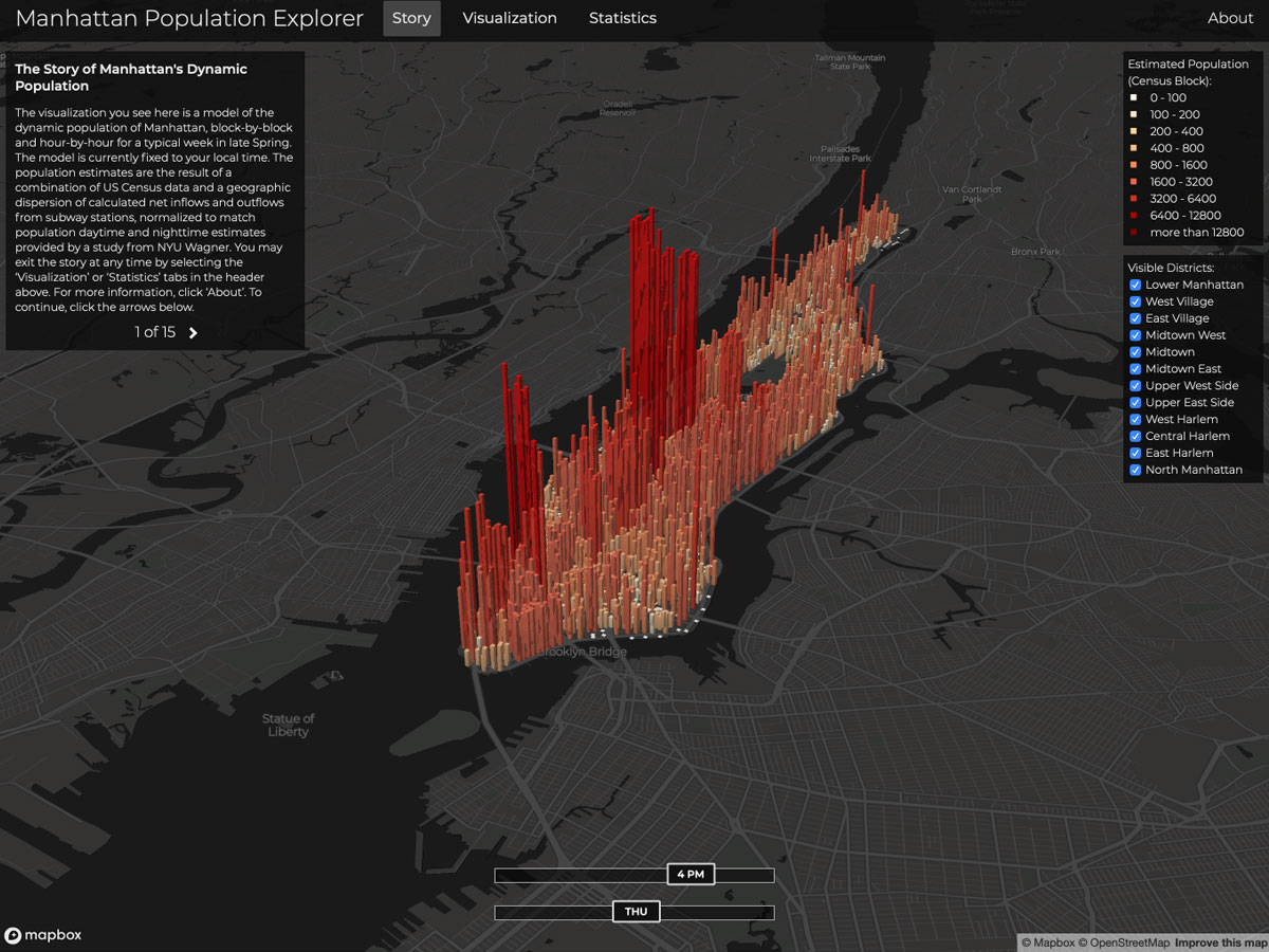
Manhattan is the most densely populated county in the US and one of the densest areas in the whole world. It also has an astonishingly high ratio of daytime-to-nighttime population, as nearly 2 million commuters arrive there each day.
ManPopEx illustrates the day-by-day changes in Manhattan’s population on an hourly basis.
Explore the map: http://manpopex.us

The True Size of Countries
By looking at a traditional 2D-map you wouldn’t think that Madagascar is more than 1,7 times the size of Finland (that’s where our HQ is!) Basically the further away from the equator a country is, the bigger it seems in comparison.
Take a look at this educational and easy-to-use map, that puts things literally into perspective.
Explore the map: https://thetruesize.com/

Estimated Net Immigration
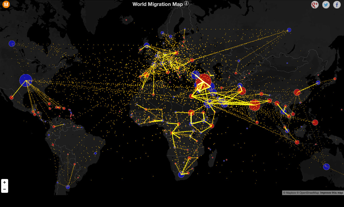
This map uses data from the years 2010-2015, but it doesn’t take anything away from the great idea and execution. You’ll see the flow of people migrating between countries and also the estimated net total for each country.
Explore the map: http://metrocosm.com/global-immigration-map/

Sources of Electricity in the US
Handling big amounts of data is always a difficult task and when you want to visualize that data efficiently, you need to also have intuitive filtering options. This is exactly what the next map on our list does.
Explore the map: https://www.carbonbrief.org/mapped-how-the-us-generates-electricity

Treepedia
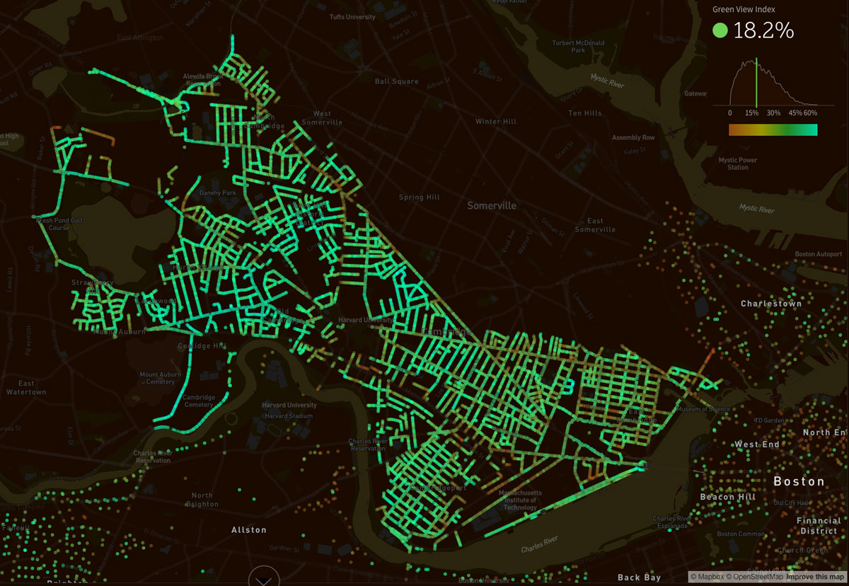
Treepedia uses a unique Green View Index to show comparable data about canopy cover in different cities. The map itself is only one portion of the story. It gives you an informative and easily glanceable view of the city, but you can dive even deeper with graphs and some key values.
Explore the map: http://senseable.mit.edu/treepedia/

Dive deeper
The versatility of interactive maps offers great possibilities for data visualization. You should always make an effort to bring out the most crucial information first, and create necessary filters to make everything look simple enough.
Consider also making the key points available in some other format besides the map. As of now, the WCAG doesn’t require all map-based information to be accessible, but we can still try our best to exceed the expectations.
After all, that’s what all of us GIS professionals are accustomed to – coming up with clever, new ways of displaying data.
Get inspired!
Join our mailing list to keep learning more about interactive maps.
[activecampaign form=5 css=0]
